

Redesigning the recruitment experience to enhance efficiency, engagement and accessibility as well as designing intuitive, efficient and user-friendly recruitment platforms to streamline the hiring process for candidates and recruiters alike.
Absa Bank sought to modernise and streamline its recruitment process, ensuring a seamless and engaging experience for both candidates and hiring teams. Our goal was to design an intuitive, data-driven hiring platform that would reduce friction, improve efficiency and align with Absa’s brand values of innovation and inclusivity.
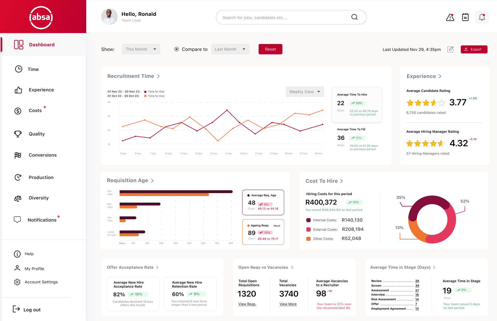
⬩Reduced time-to-hire by 18% through improved automation and user workflows.
⬩40% increase in candidate form completion by streamlining the application process.
⬩Recruiter efficiency increased by 13.5%, thanks to smart filters and automated interview scheduling.
⬩A mobile-first, accessible platform ensuring candidates could apply anytime, anywhere.
⬩Improved communication and transparency, leading to a better overall experience for both recruiters and applicants.
Problem
The talent acquisition process at Absa Bank faced inefficiencies, inconsistencies and a fragmented experience for candidates, hiring managers, and recruiters. The hiring process was fragmented, leading to delays, miscommunication and frustration for both candidates and recruiters. Existing recruitment platforms were either too complex or lacked essential features, creating inefficiencies in screening, scheduling, and managing applicants.
Solution
To design a modern, intuitive and data-driven recruitment app that simplifies job applications, improves recruiter workflows and enhances the candidate experience.
Plan of Action
The design process isn't this linear but for the most part, it was as follows:
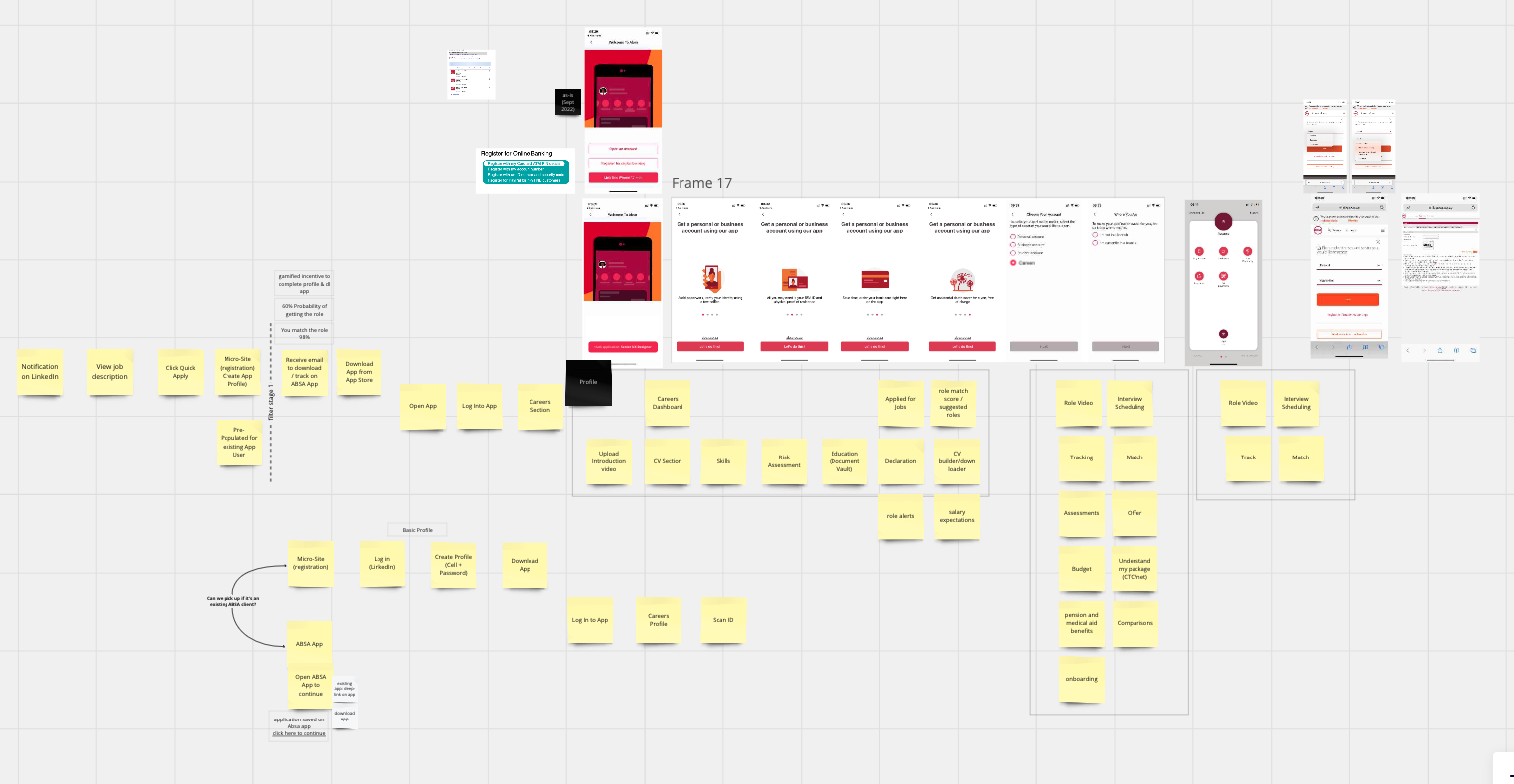
Research - I conducted interviews with recruiters, HR teams and new hire to understand pain points. Then drafted the current (as-is) and future-state (to-be) service design blueprints, as well as mapped the end-to-end process to reimagine the hiring journey and identify inefficiencies or bottlenecks. Lastly, I conducted competitor analysis to assess existing recruitment platforms.
Ideation & Prototyping - Wireframes, low-fidelity sketches and interactive prototypes were created to explore solutions. This included solutions such as a dashboard for recruiters and a self-service portal for candidates to streamline communication.
Testing & Refinement - With the help from internal stakeholders, I assisted in conducting usability tests with recruiters and candidates. I could then iterate based on feedback to refine the navigation, reduce steps in the application process and improve accessibility.
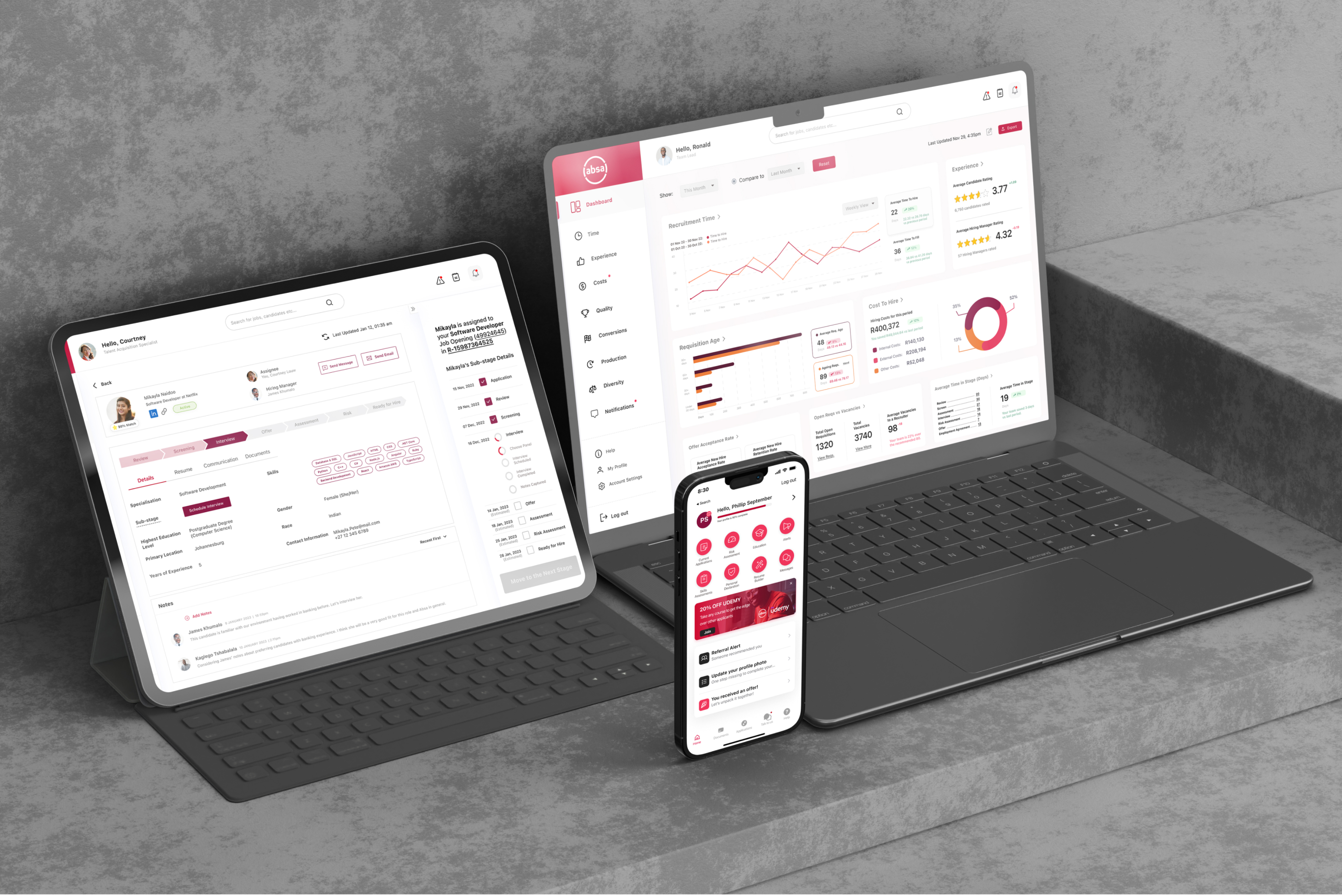
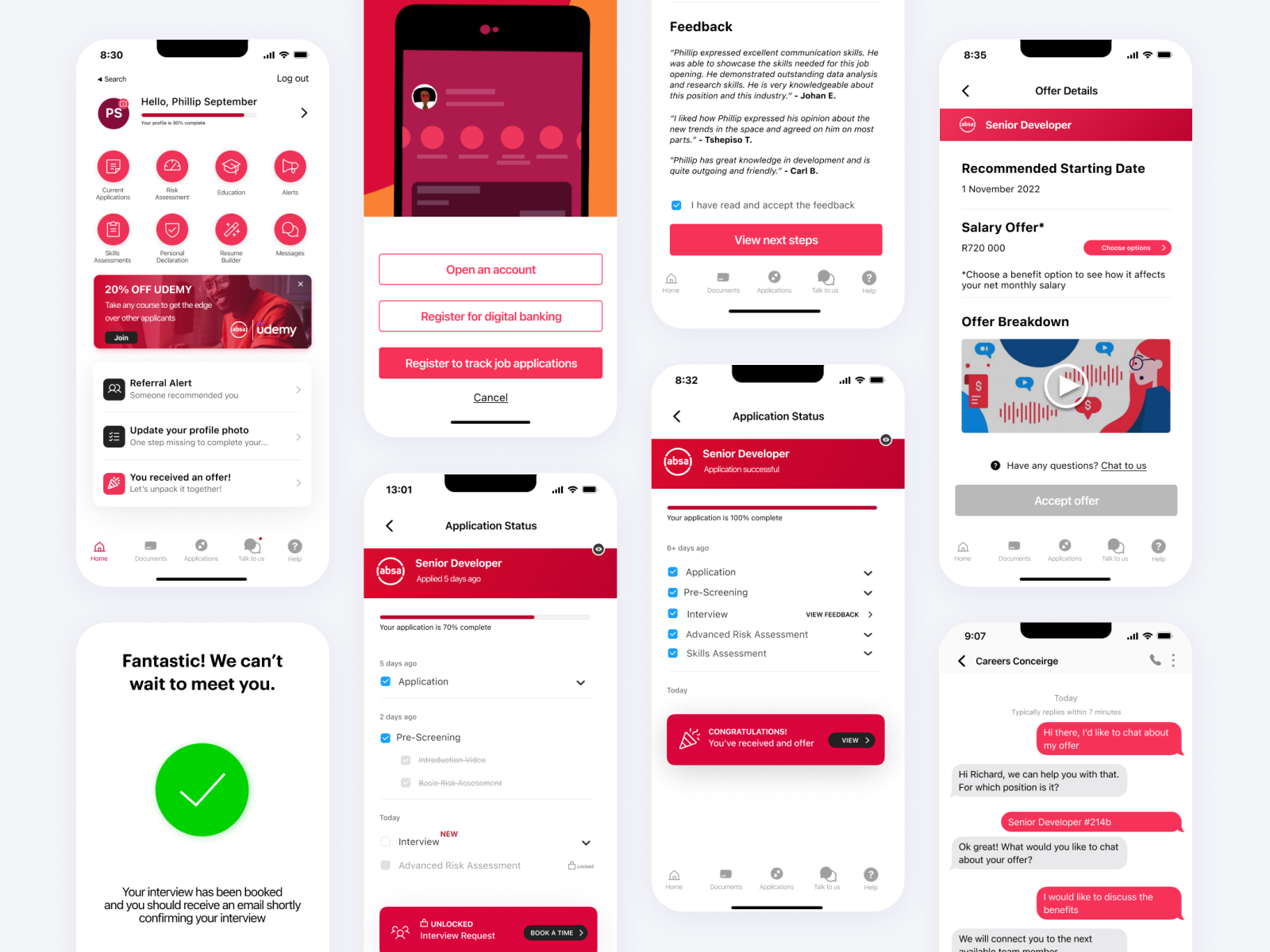
⬩Streamlined Job Application Process
⬩AI-Powered Candidate Matching
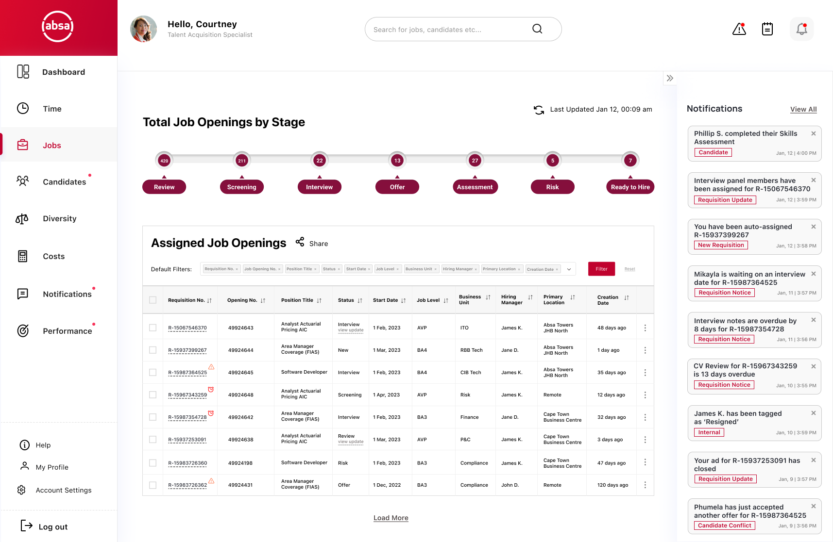
⬩Enhanced Recruiter & Hiring Manager Tools
⬩Real-Time Candidate Progress Tracking
⬩Employer Branding & Candidate Experience
⬩Data-Driven Insights & Reporting
⬩Integration with HR & Onboarding Systems
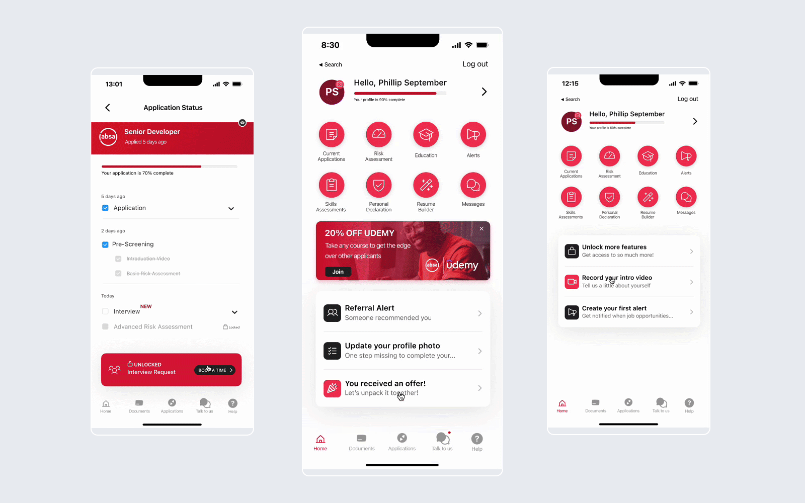
Midway through the project, we realised that one of our biggest assumptions was wrong. Hiring managers weren’t using the new self-service features as expected. Despite making the platform more intuitive, many defaulted to old habits, manually handling tasks instead of leveraging the new system. Early usability tests revealed that candidates were dropping off during the application process—despite simplifying the design, many users found it overwhelming. Form fatigue was a major issue, as applicants had to input redundant information multiple times.
Instead of forcing adoption, we introduced progressive onboarding and in-platform guidance to help users transition smoothly. We also worked closely with HR leadership to integrate automated reminders and nudges, ensuring that hiring managers gradually embraced the new workflow.
To reduce friction, we introduced:
⬩Auto-fill capabilities - pulling data from LinkedIn and uploaded resumes.
⬩Progress indicators - to give users a sense of completion.
⬩Save/resume functionality - allows users to complete applications at their convenience.
This project reinforced the importance of validating assumptions early and adapting to user behaviour. While a seamless experience is crucial, change management and user adoption strategies can be just as critical.
What seems straightforward to designers may still create friction for users, especially in high-stakes interactions like job applications. By listening to feedback and iterating quickly, we transformed an overwhelming process into a seamless, user-friendly recruitment platform.